Proactively keeping park visitors informed
However, the Gates of the Arctic (GOTA), though beautiful, is a preserve with no human trails, no roads, and no cell signal, and most apps don't adequately prepare you for that. Our goal was to resourcefully educate and hold tourists accountable during their travel to the Gates of the Arctic.
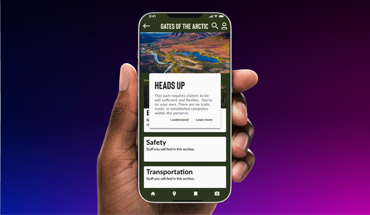
Planning travels to National Parks can feel like an exciting task, and thankfully there are many apps out there to help you with that. Most apps focus on how tourists can freely interact with their environment and sightsee. However, the Gates of the Arctic (GOTA), though beautiful, is a preserve with no human trails, no roads, and no cell signal, and most apps don't adequately prepare you for that.
Our goal was to resourcefully educate and hold tourists accountable during their travel to the Gates of the Arctic.
The team and my role
During this project, I've worked with 3 additional Designers. My role focused on the following critical areas throughout the lifecycle of this project:
- Project management and developed workflow for synthesizing research
- Creating end-to-end UX & UI implementation of concepts and ideas
- Designed components for high-fidelity animated prototypes
- Collaborating closely with lead designers and researchers
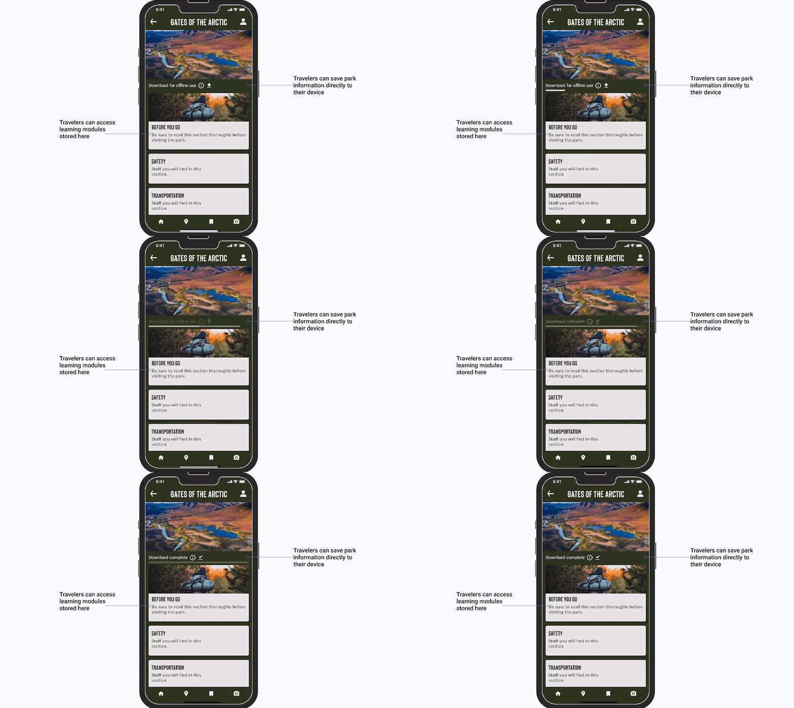
Defining key pain points
Before we jumped into designing, we collected and distilled down the specific key points and challenge areas that we wanted to change and improve on compared to other National Park travel apps:
- Lacking comprehensive assistance for trip planning to the GOTA
- No straightforward method for providing park safety and preservation information
- Lacking consistent navigation and search filters and breadcrumbs throughout the current app
The process
User research & interviews
Having deep conversations with six experienced hikers.
Through our interviews, we discovered a strong need for education before entering any park to be safe and responsible. Interviewees noted, post-usability test, that the navigation of the app became confusing as you toggled through the screens.
Defining key ideas
With our users, key pain points, and a deeper analysis of the current site in mind, our team set off to define the problem. How might we provide access to park safety and etiquette training for park users to limit harmful situations and promote park conservation?
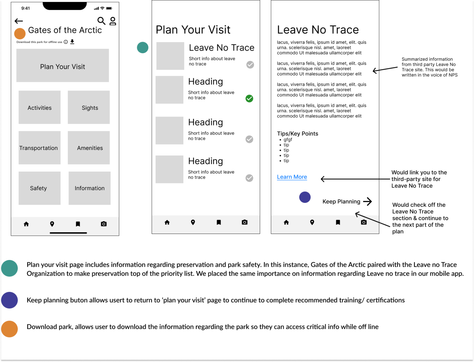
Well, here lies our problem, the park would need to verify users have completed safety and etiquette training before entering the park. Training is essential for users to be prepared for various situations while maintaining park preservation.
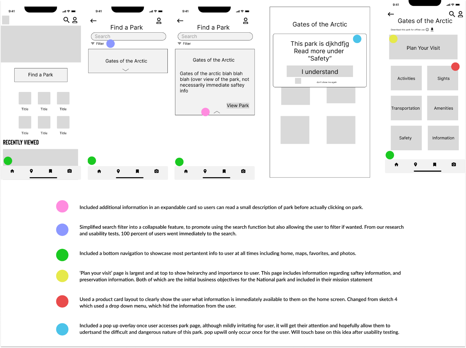
Low-fidelity ideation
High-fidelity polish
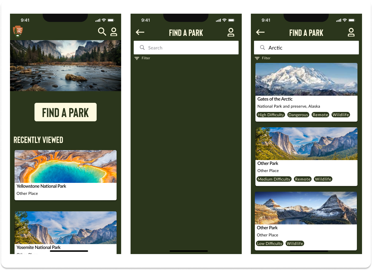
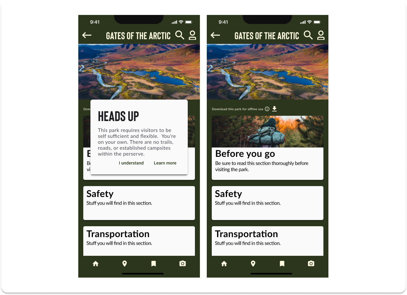
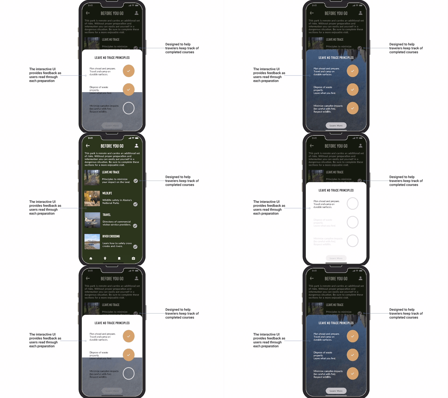
Final mock-ups
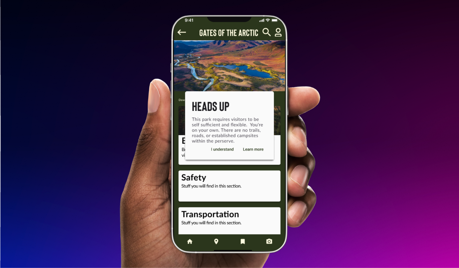
Impact generated
We conducted one round of usability tests. After twenty-two (22) participants, we saw the following feedback both from our metrics and from our users as well:
- 81.9% of users had success locating GOTA safety information
- 94.1% of users had success downloading GOTA for offline use
Comments such as:
- “everything ran really smoothly!”
- “love this concept”


Comments ()